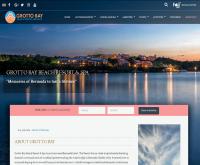
After researching web design companies I was lead to Internet Marketing and Design. After our first meeting, I was convinced I wanted them to design our new website. Working with Terry has been very easy, educational and a great value.
Bob Fino
Terry at Internet Marketing and Design created an excellent website for our Men’s Personal Apparel site. Our ranking grows stronger each month thanks to Terry’s continuous support. Terry is full of design ideas and we count on him heavily to assist us in creating new ways for us to reach our customers.
Mark Block
Internet Marketing and Design have built me amazing websites for over ten years. Terry Young has never failed to answer the phone or to sit down with us in all those years for support. Exceptionally rare customer support and quality work in this day and age...
Don Shipley
Terry and his company have been outstanding. My business has consistently showed up on the first page of all major search engines. I made a wise choice going with Internet Marketing and Design. Call Terry!!
Robert Wegman
Built to Last was long overdue to bring our website into the 21st century. Terry and his team revamped our site in a very thorough and timely manner, and we experienced noticeable positive results almost immediately. We are a seasonal business and it was as if spring arrived very early this year!
Rick Spink
We have been customers of Internet Marketing and Design for over 20 years. They have designed and redesigned our two web sites for our Chesapeake dental office. The sites are our number one referral source. I highly recommend Internet Marketing and Design to everyone.
Kelly Dishongh
"We had two old company sites in need of serious redesign. Internet and Marketing and Design quickly determined the steps needed to accomplish them. I highly recommend them to anyone looking for great service and a professional end product."


